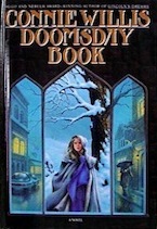
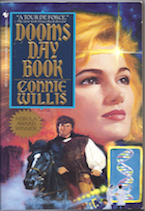
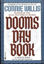
Probably the first way a lot of readers will interact with a book is through the cover. Even in today’s online world where the covers are thumbnail images much smaller than a cover you would browse in the bookstore or library, the cover is still so important in creating the first impression of what’s inside. Genre blended books have a lot of challenges when it comes to marketing, including what cover to put on the book. Do you emphasize one genre? Another? Go for something neutral? One of the good things about the change we made with the Genre Blender to host cover images locally rather than serve them from Amazon is that I got to choose which cover to include in the database. For all the titles here I saw the first cover served up and said….nope, that’s not it. Sometimes it was because the cover was different from the one on my shelf, but sometimes the covers were surprisingly, completely different from what I expected, knowing what was inside the cover.
Less Genre-y Covers
Publishers sometimes change a genre over different editions to try to attract different audiences to a title. Here are a few covers that started out more obviously genre and end up with fewer genre cues on the cover, perhaps to make them an easier sell to non-genre readers.
Doomsday Book by Connie Willis
One of my favorite genre books, this is the first of Connie Willis’ fantastic time travel SF/Historical blends. (more…)


